
Sandy Springs Renovation Reveal, Part 1: Kitchen, Dining Area and Family Room

This project was a long time in the making. I had initially met with theses client pre-covid to figure the best way to renovate their home. We had gone so far as to begin getting estimates. And then, you guessed it, COVID happened. Everything got put on hold for the next 2 years. It actually was a blessing in disguise. It really allowed the homeowners to prioritize their renovation goals to get a home that would allow them to relax, unwind, and entertain family and friends. They wanted a place for their grown children to come home and stay when needed. They wanted a livable and beautiful home.
This became a full home renovation where the kitchen, primary bathroom, and multiple other rooms were touched in some way. The first area of concern was the kitchen which opened up into the family room. This is what it looked like before we started:
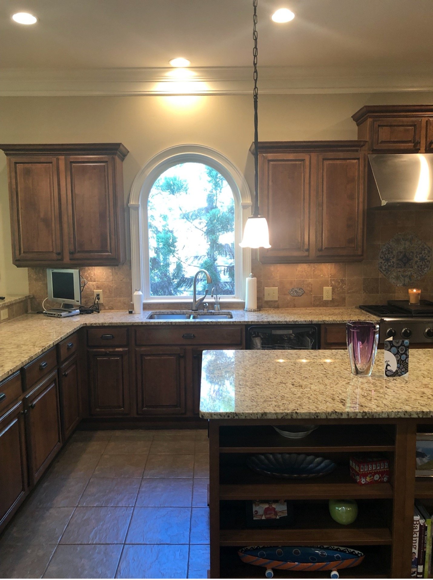
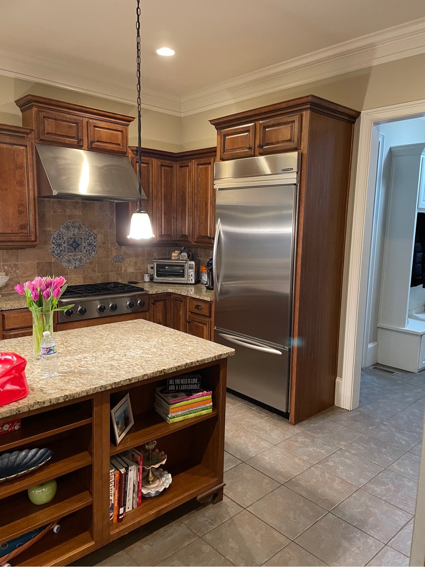
The kitchen had dark cabinets and a tile floor. The cabinets were high quality and in good shape other than the finish. The backsplash was as old as the home and dated. The space opened up into a large eat in area.
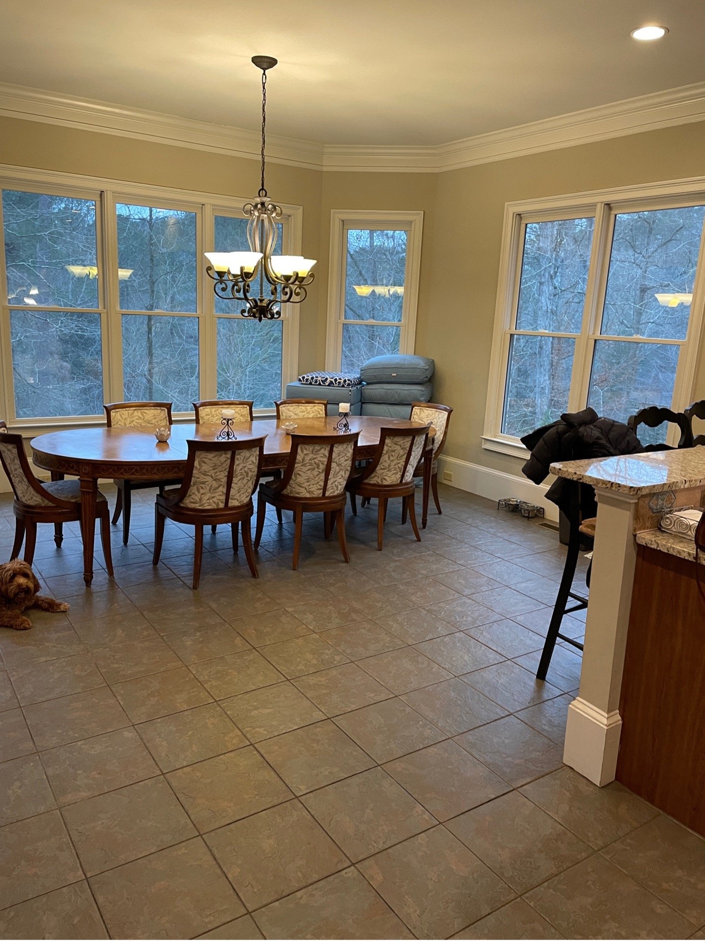
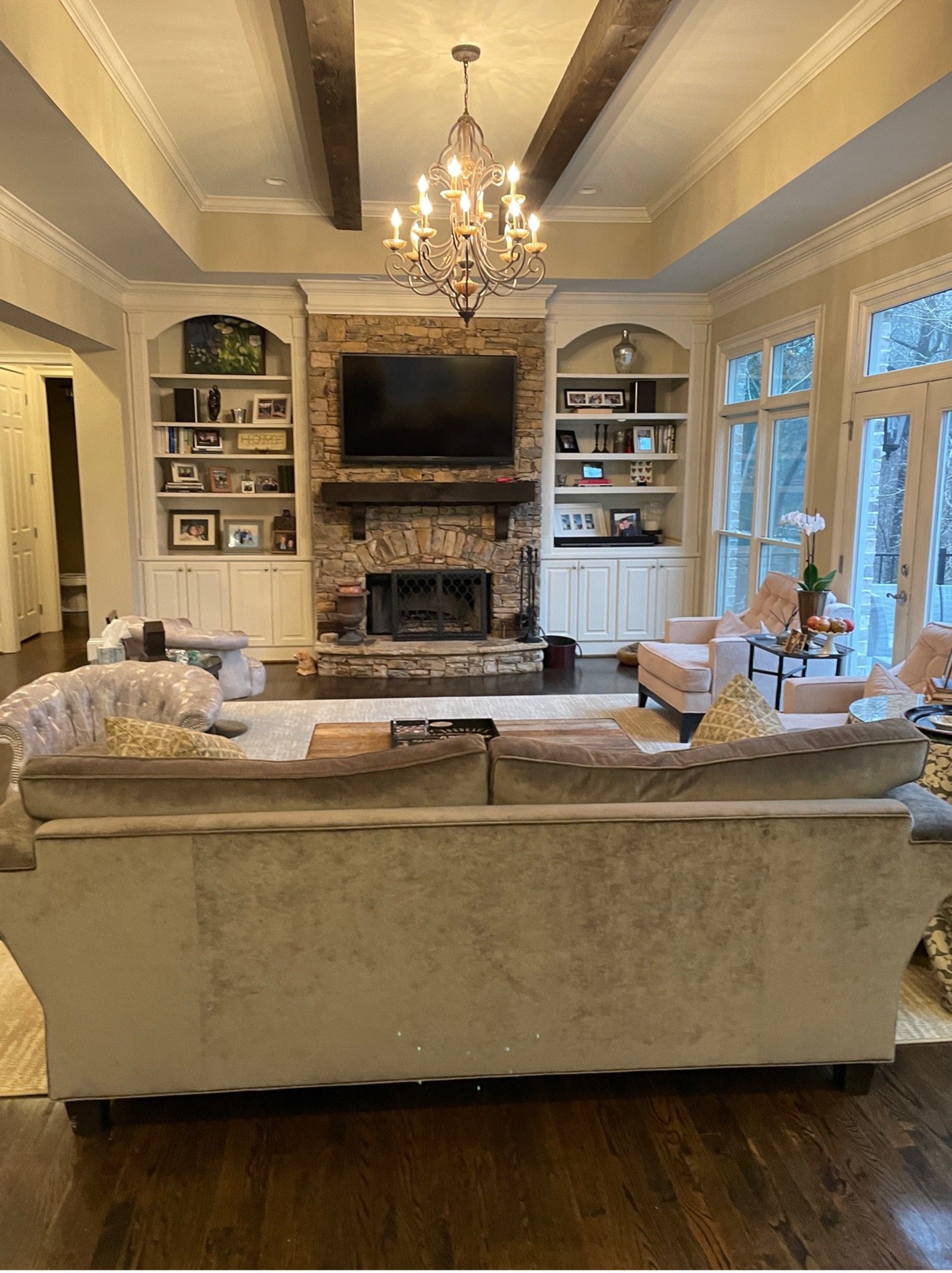
It was also open to the family room.
We wanted to tie all three areas together to make it feel like one big space and be fluid. The first decision was to extend the hardwoods into the kitchen and eat-in area. That was a huge win for uniting the spaces. The homeowners wanted light and bright for the whole house. They knew they wanted a white kitchen, too. We wanted the kitchen to have some interest and not just be a white box. We painted the island a gorgeous navy and added bright lighting with gold accents to all three spaces.
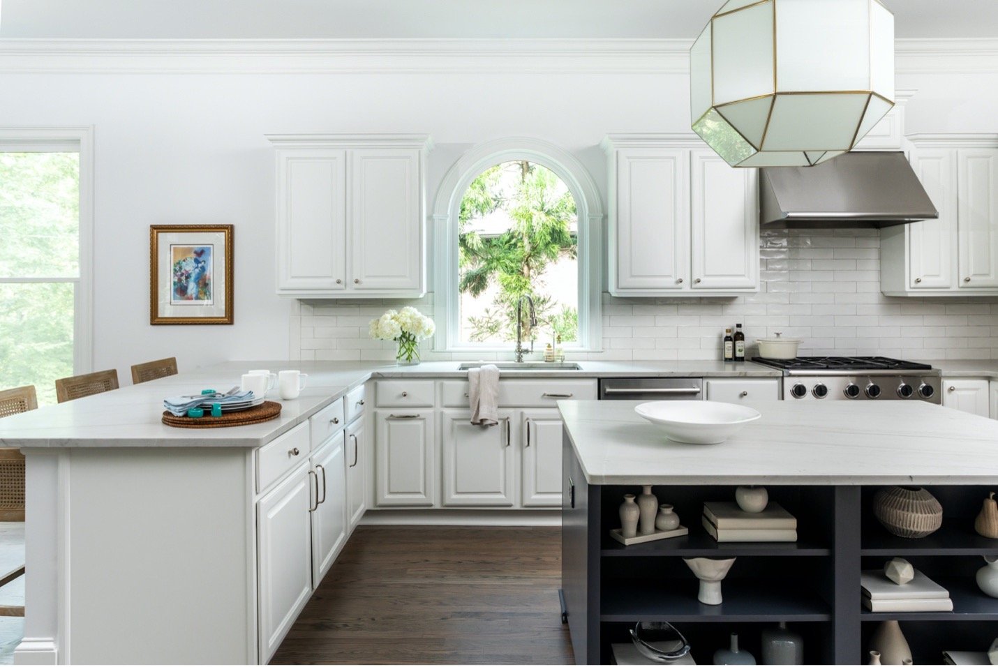
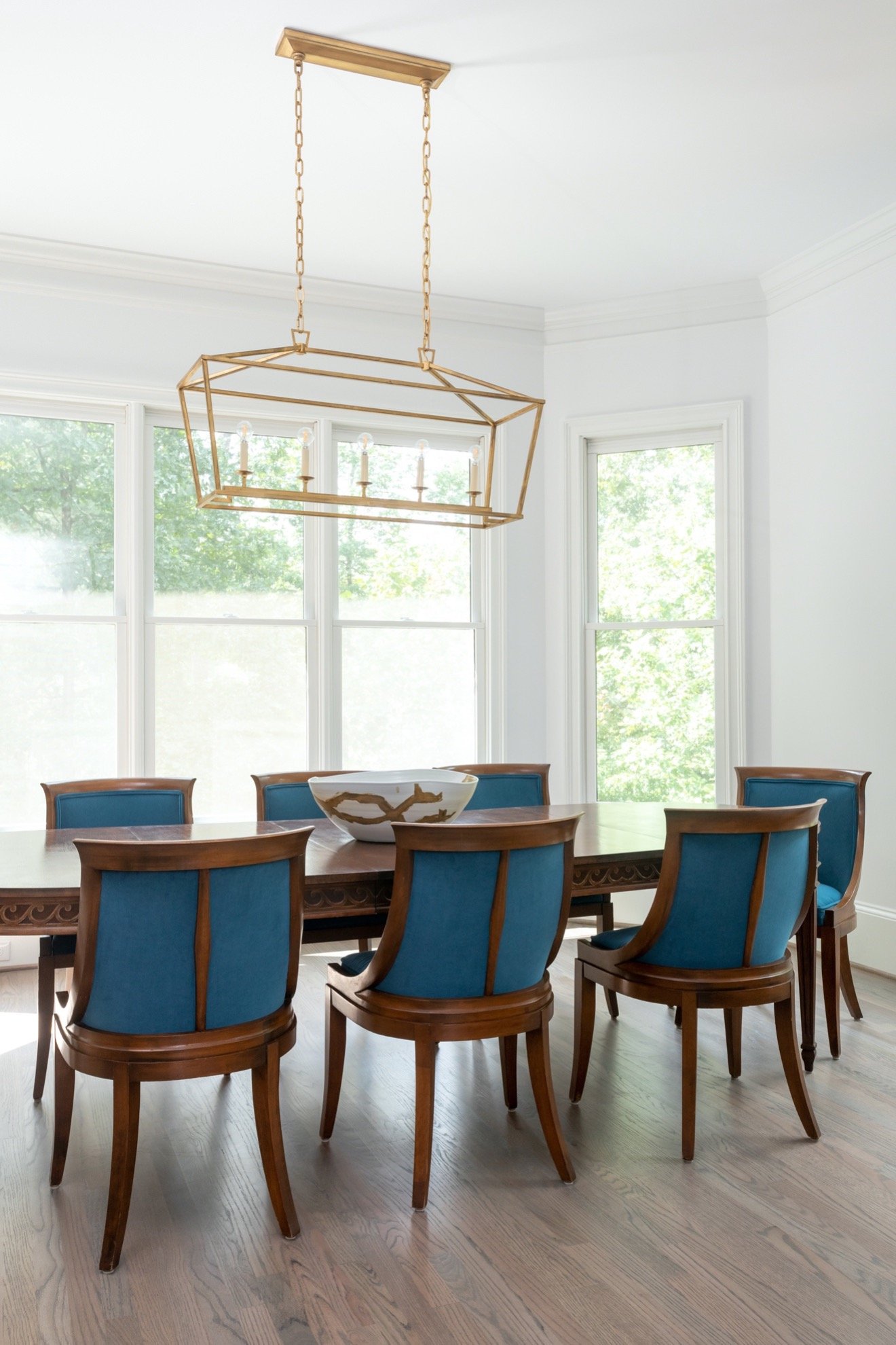
We also carried the blue into the family room cabinets. By repeating the same color the spaces came together even more.

We left the stone fireplace, mantel, and wood beams as they were, originally. Just by painting the cabinets the space felt totally different. We changed the furniture arrangement to make it feel more conversational.
To lighten up the space even more we refinished the floors in a lighter stain.
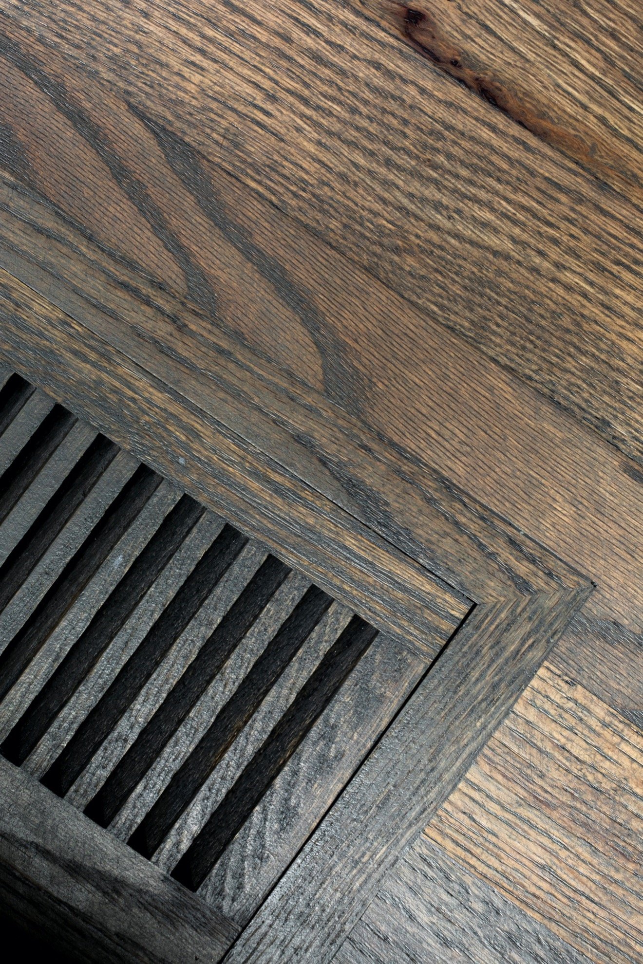
We changed out all of the vents to wood ones that would match the floors. This was an upgrade for the entire home.
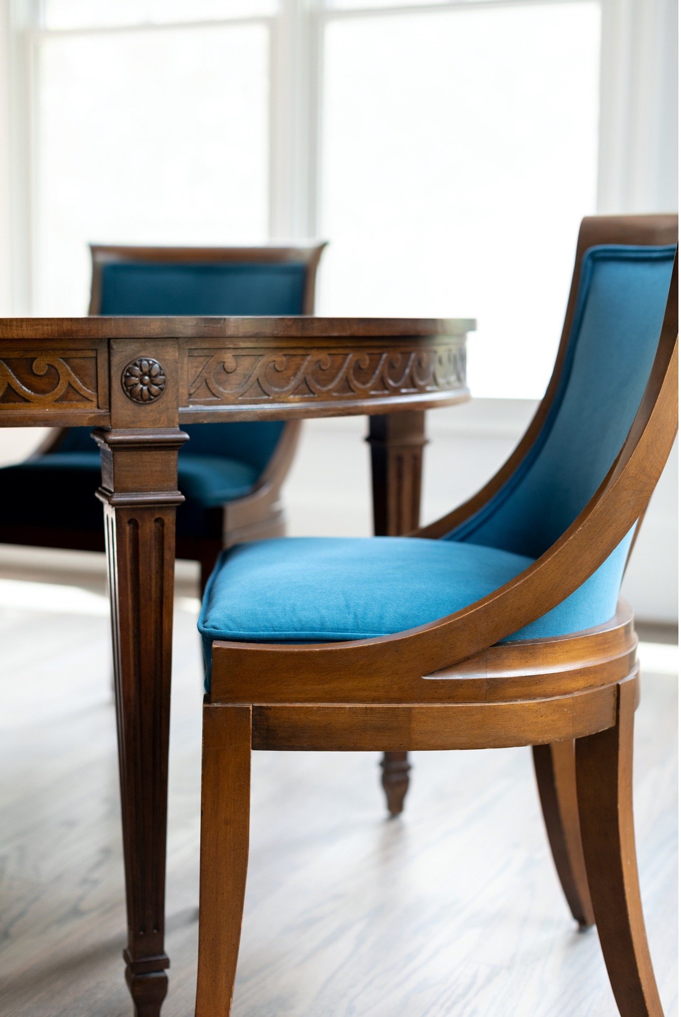
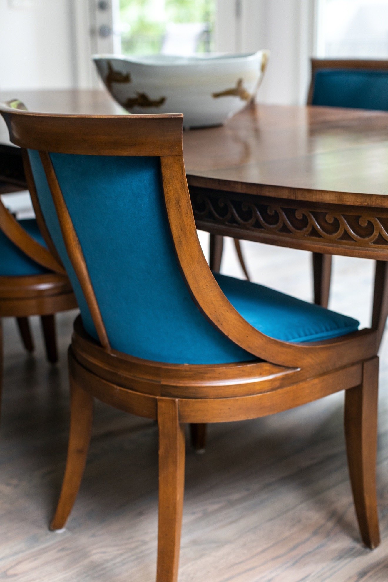
We jumped on the infusion of blue and refinished the dining area chairs in a blue velvet. It looks beautiful and is a performance fabric that won’t mess up easily.
I found this unique bowl that has a translucent blue hue. It makes a statement next to the velvet chairs.
By keeping the cabinets we were able to save a good bit of money and filtered it into other parts of the project. We replaced the backsplash with a handmade-style subway tile in pale white. It wasn’t a bright white, but had a softer tint to coordinate with the new countertops.
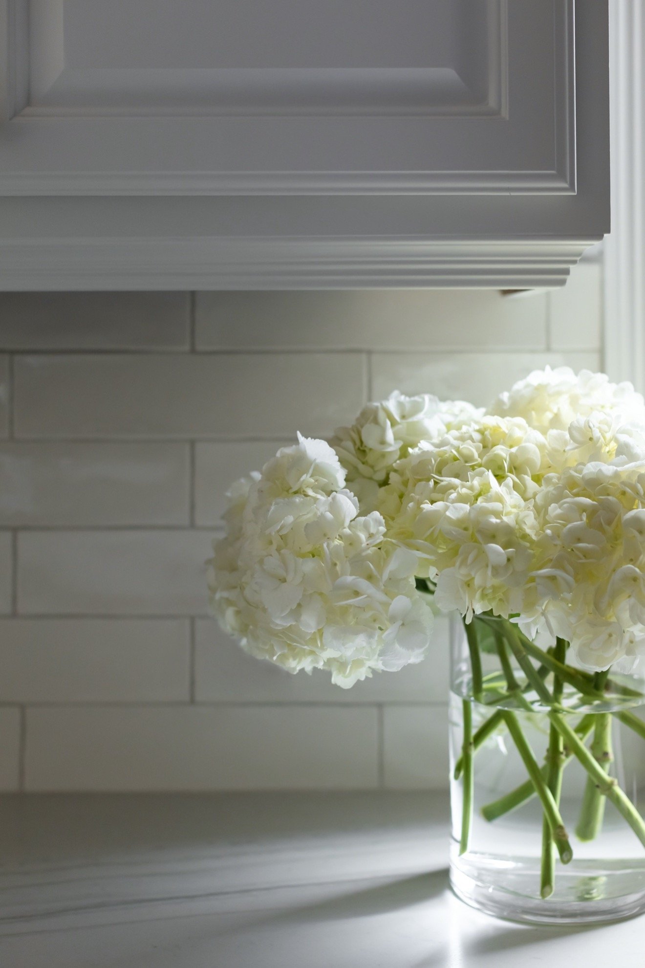
We found an exquisite quartzite that was a beautiful addition to the existing cabinets. We added polished nickel hardware and used a mix of knobs and handles for a more interesting look.
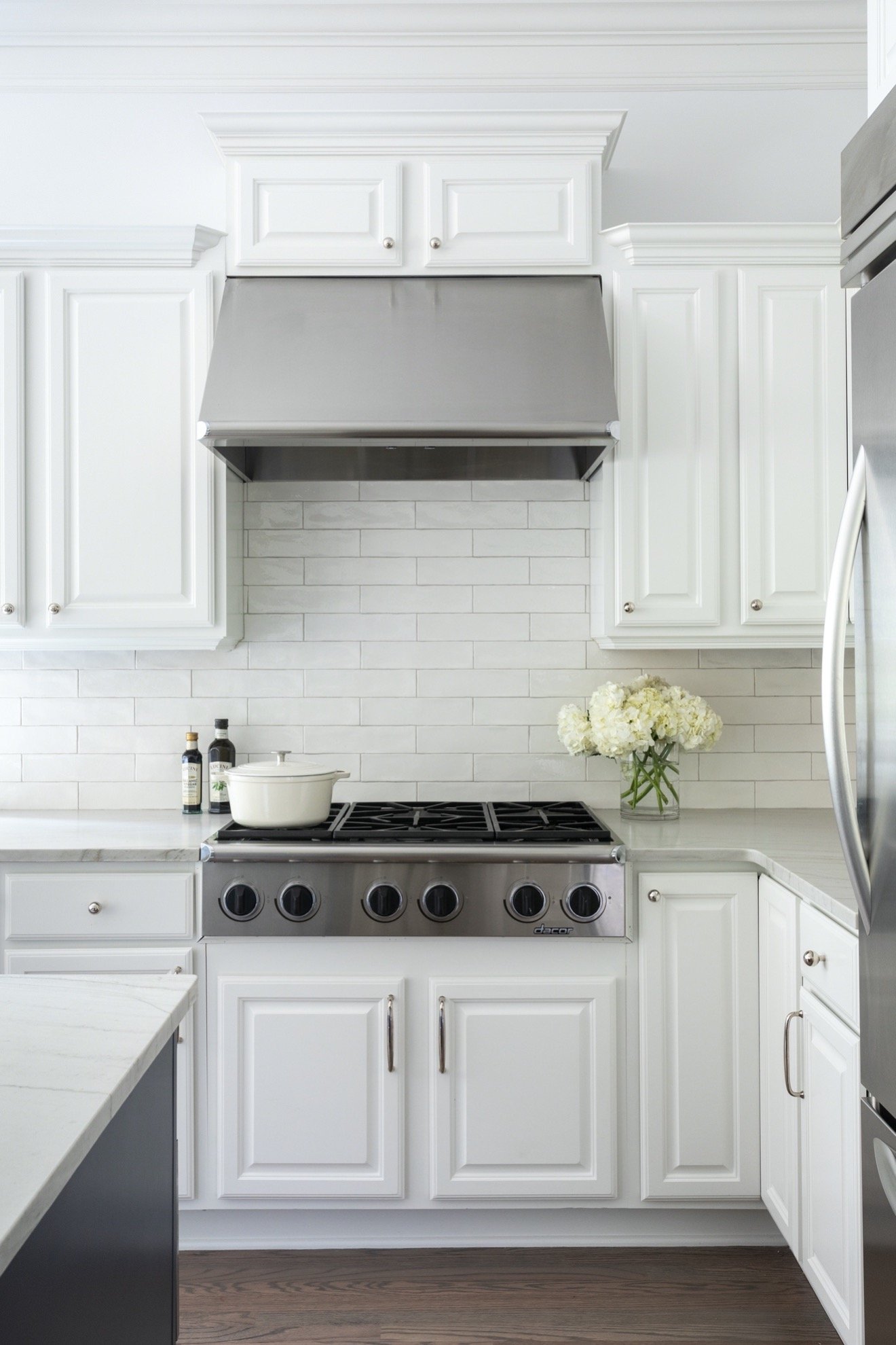
We replaced the double bowl steel sink with a single one and added a polished nickel faucet. The faucet is one of my Kohler favorites.

Another tactic we used for this renovation was to lower the bar area to counter height. It extended the usable space of the counters so there was a larger area to eat, serve, and prepare food.

The finishing touch to the space was adding new counter stools. These are not only comfortable, but also are in line with the look of the home. We used the blue theme by selecting a simple, blue plaid fabric for the stools. They are a beautiful addition to the home.
When you walk into this home there is a happy vibe. You feel it everywhere! It’s upbeat, bright, light and inviting. It’s a place you want to stay and linger.
Stay tuned for the reveal of the powder bath and mudroom area.
+ Comments
- Comments


This is a fantastic before-and-after look at the kitchen renovation! The transformation is amazing, and I especially love how much brighter and more open the space feels. The white cabinets and the removal of the soffit [mention of soffit removal if applicable in the blog post] were smart choices.
While the focus here is on the kitchen, I’m curious about the exterior of the home. The before picture hints at a stucco exterior. Do you have any plans for refreshing the stucco in the future renovation stages? I’d be interested to see how you tackle any updates to maintain the beautiful overall aesthetic.
https://www.tucsonstuccocontractors.com